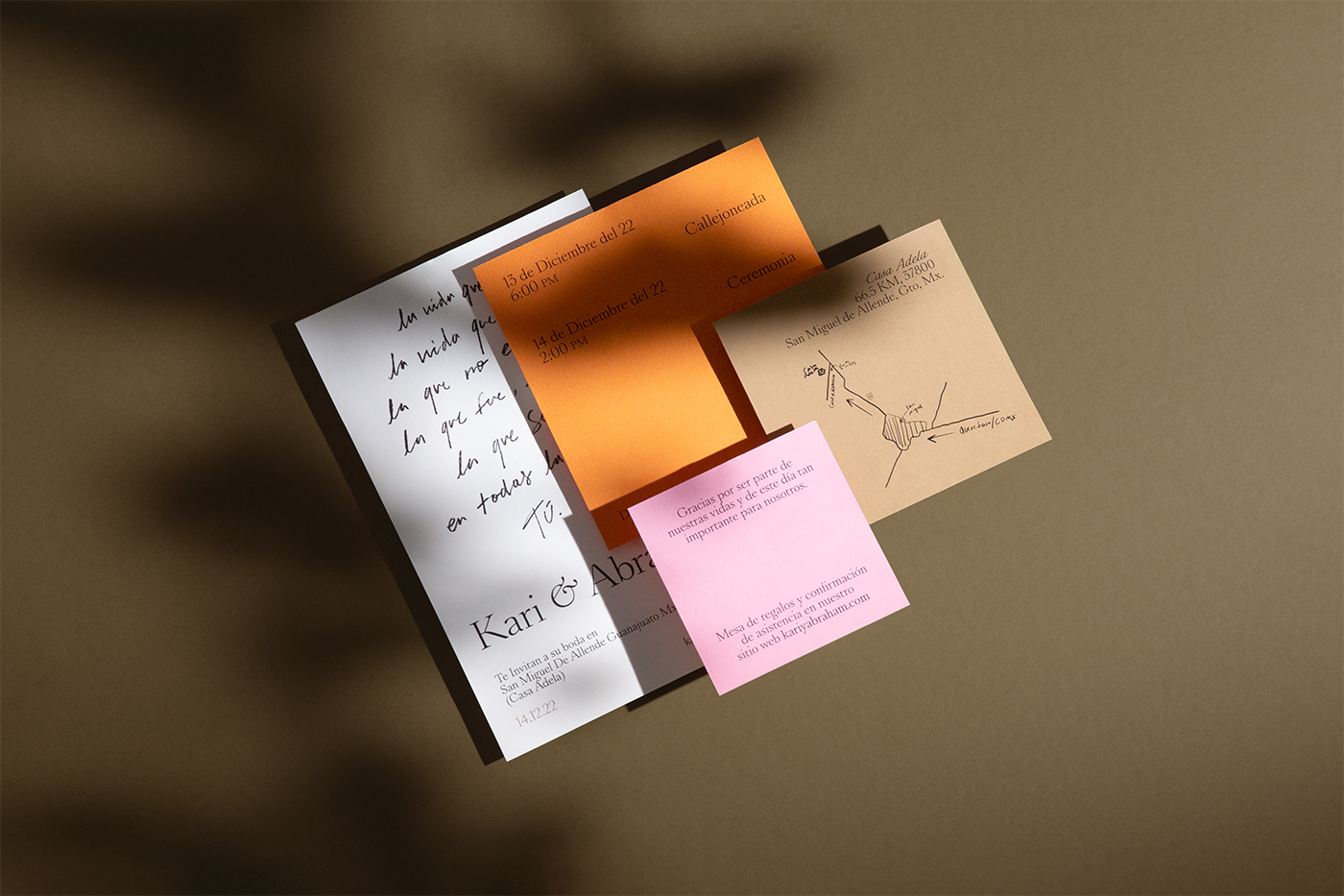
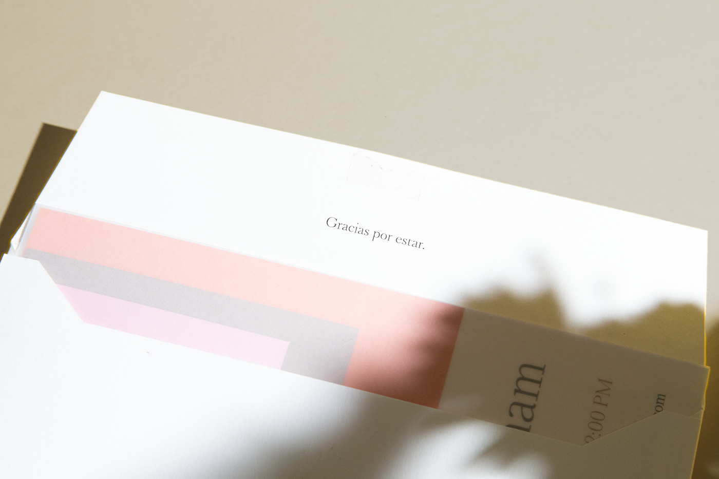
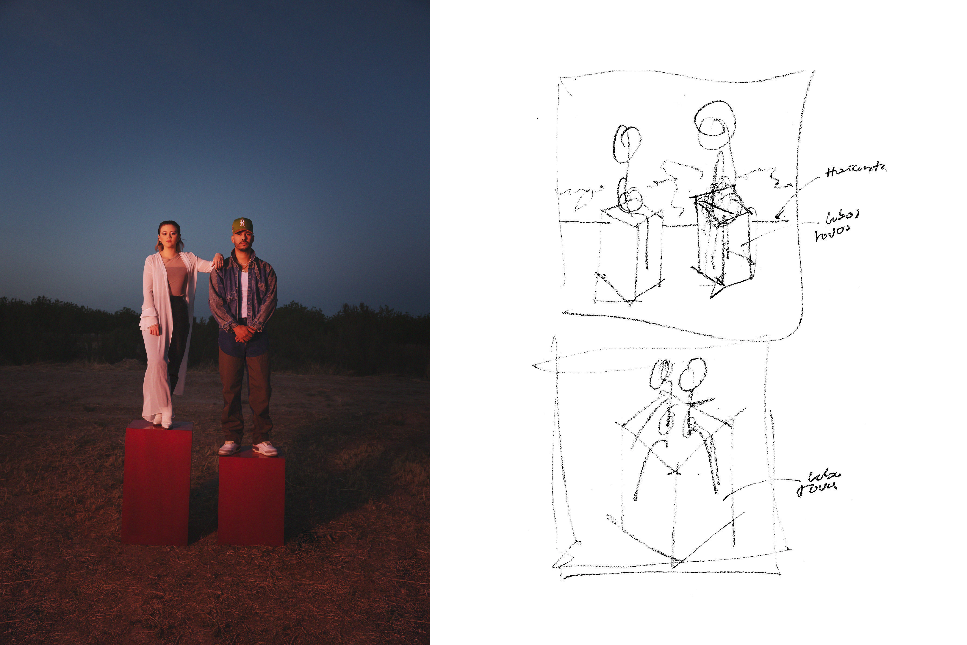
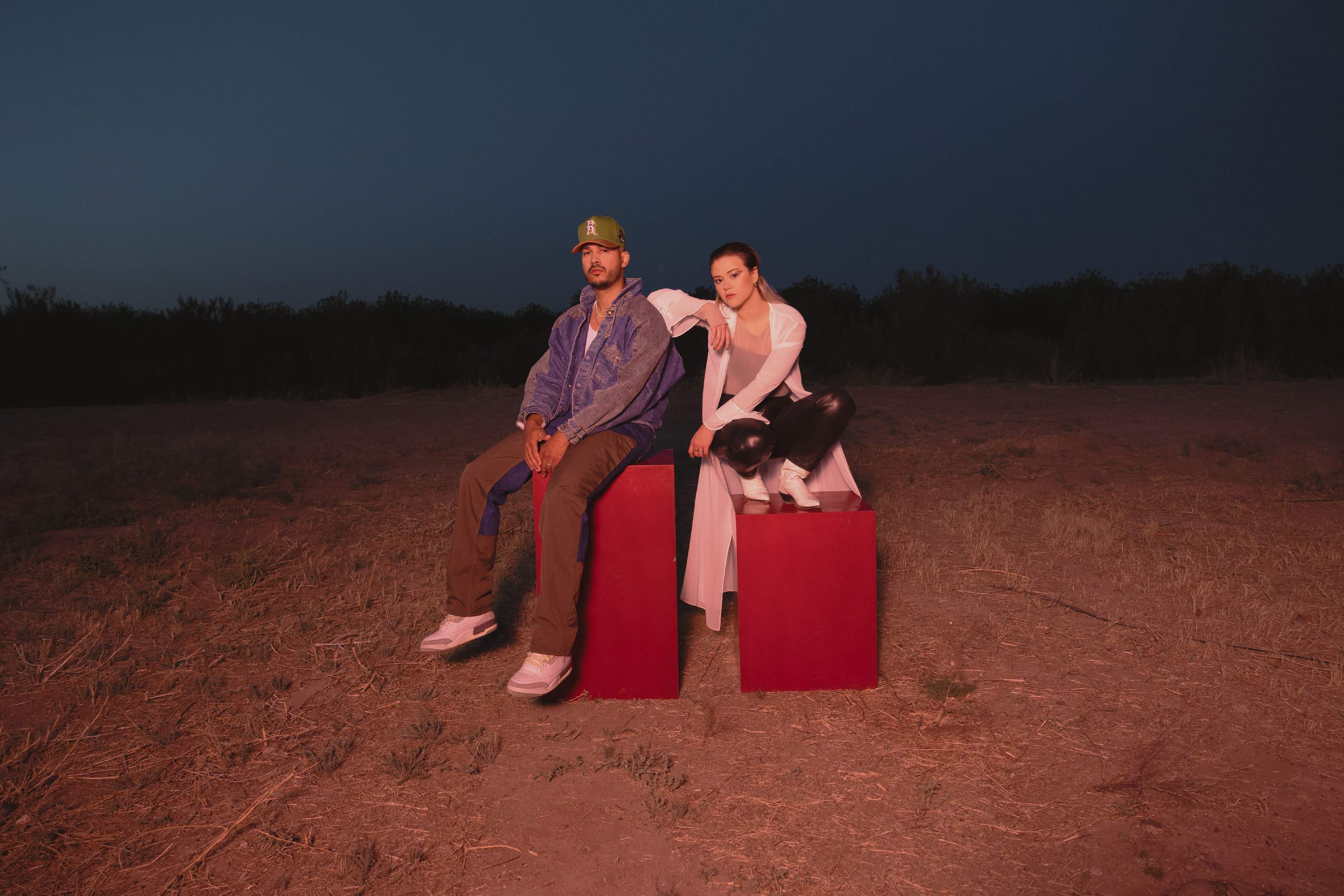
SABIO STUDIO

Sabio Studio emerges as an avant-garde design and branding studio, where our creative journey is propelled by the synergy of astute research and innate intuition. 


Chal
Branding
09–27–2023

︎ Design & concept
︎ Logotype
︎ Icon
︎ Stationary
︎ Type Design

Chal is a family-owned business. The name is a reflection of the union between the surnames 'Chavez' and 'Alvares.' It was essential for this project to highlight the presence of its constituents and align it with their vision as architects, which is rooted in honesty, professionalism, and innovation. To achieve this, we've incorporated modern grids along with a mix of typography that unveils the character of their project. We've even crafted handwritten lettering for each of their names to uphold the brand's authenticity. Collectively, these elements culminate in an image that distinguishes their practice within the architecture market and propels them toward their project goals.

Kim & Indiomar
Photoshoot
08–23–2023

︎ Art direction
︎ Photoshoot
︎ Styling
︎ Produced by Nomad Music house
︎ Creative direction and color editing by Lluvia Richards

Our approach to this project aimed to amplify the already visionary perspective of Nomad Music House, who not only produced but also directed the project. The visual pivotal thread that breathes life into the entire endeavor is the color red, serving as the cornerstone of the album cover's design. The underlying concept was to liberate the color red from its conventional context, giving rise to an unconventional visual narrative.
Titled "Mi Religion," the project's very name holds significance. Hence, we conceived the notion of incorporating two prominent red cubes. These cubes ingeniously symbolize the two featured artists, elevating them as they stand atop the cubes. In a metaphorical sense, these cubes represent both the artists' individual "religions" or artistic identities and the platform they stand upon.

Lirio y Ave
Branding
01-11-2023

︎ Type design
︎ Lavels
︎ Icons
︎ Color system


"Lirio y Ave" is a Mexican coffee producer hailing from Ixhuatlan del Café in Veracruz, MX. The essence of this project's nomenclature and visual focus is to provide a profound perspective on the intricate journey entailed in crafting a coffee bean. This journey commences by delving into the innate dynamics between the heavens and the earth, culminating in the miraculous birth of a coffee bean.In this symbolic narrative, "Lirio" embodies the earthly realm, while "Ave" gracefully signifies the celestial domain. The creative inspiration for developing the visual elements emanates from the rich tapestry of religious illustrations and literature.


Isra Hermosillo
Branding
03-23-2022

︎ Type design
︎ Stationary 
︎ Icons
︎ Photoshoot


Every facet of this project draws inspiration from the environments in which music producers thrive. We derive references from a diverse array of sources, ranging from the typography found music albums to audio console brands and even the intricate details of music sheets. This amalgamation forms a cohesive visual system that seamlessly integrates within the music industry's landscape, evoking a sense of familiarity and innate connection. Additionally, we embraced a challenging endeavor: fashioning a visual manifestation of sound itself, which became an integral component of the project. This challenge propelled us into uncharted creative territories, compelling us to explore novel avenues.